On the administration interface, it is now possible to create custom forms that are fully customizable.
Forms can be freely composed of various field types such as name, email, password, file upload, dropdown list, or buttons, and any number of these fields can be added. The layout is also flexible fields can be placed next to each other and moved freely. Completed forms can easily be embedded into any textual content using a shortcode, including articles, static pages, product pages, galleries, or brand pages.
List of forms
- Languages – Specifies the language in which the forms are listed. The selected language will also be used when creating a new form.

- ID – The unique identifier of the form.
- Name – The name of the form.
- Active – Indicates whether the form is visible to customers in the store. Inactive forms are not visible to customers.
- Form Code – The code that needs to be copied and inserted into a static content block.
- Copy Code – Copies the form code to the clipboard.
- View Submitted Forms – Displays all submitted entries for the selected form.
- Export Submitted Forms – Exports submitted form entries to an Excel file. The export includes the submission ID, user, submission date, and all data entered into the form.
- Clone – Creates a copy of the selected form with a new ID.
- By clicking the Edit button, store owners can modify existing forms.
- If a form is no longer needed, store owners can delete it by clicking the Delete (trash) button.
- By clicking the Add New button, administrators can create a new form for the selected language.
- To search for a form by title, simply enter its name in the search bar and click the Search (magnifying glass) icon.
- Creating and editing forms
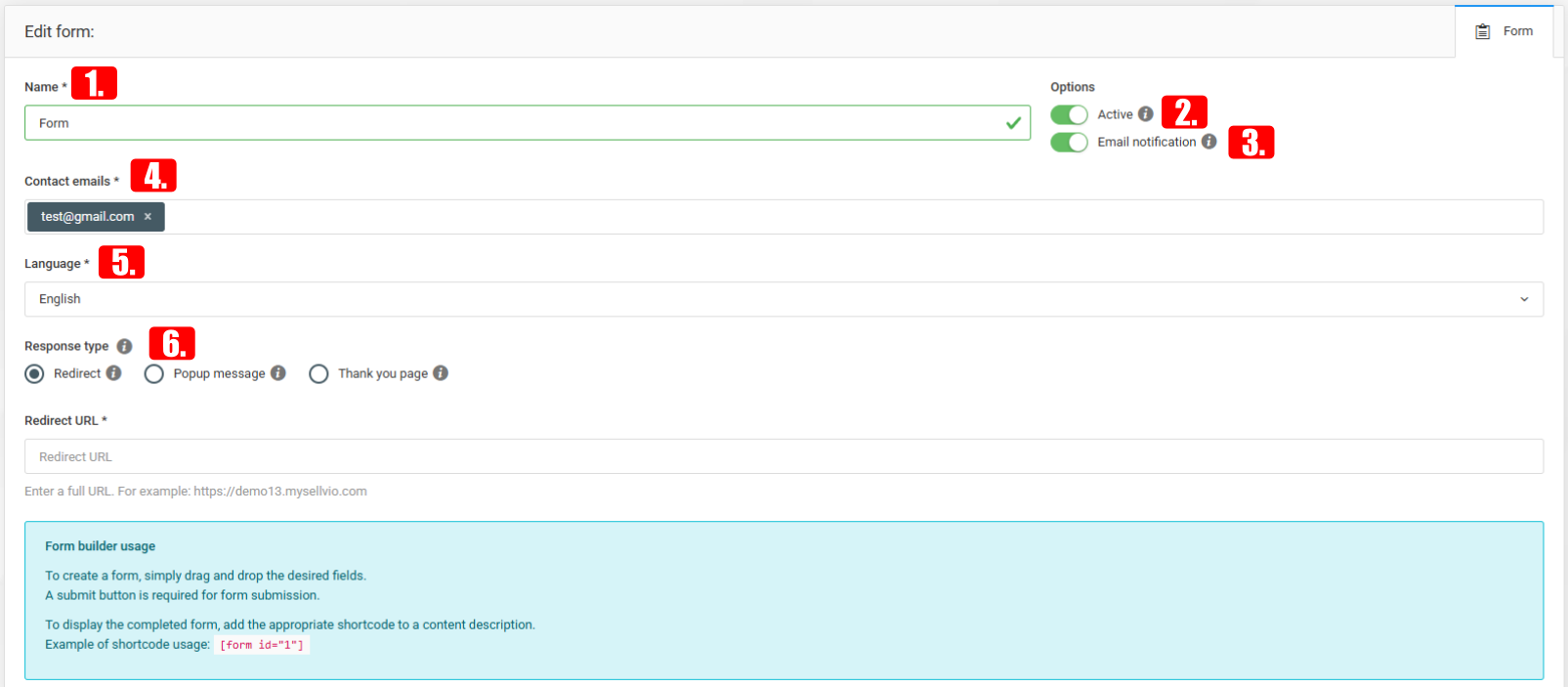
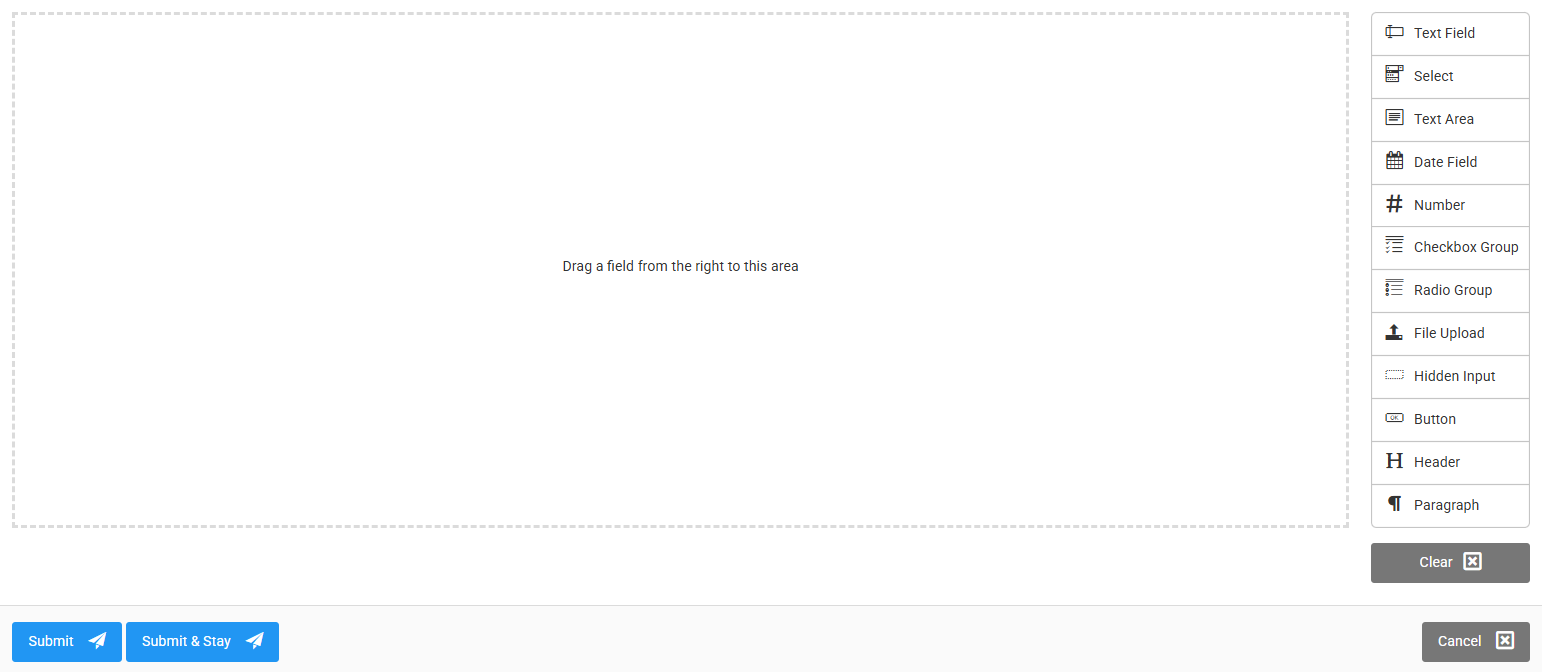
To create a form, simply drag the desired fields from the right-hand side as you wish. To make the form submittable, it is necessary to include a button field.
- Name – the name of the form
- Active (enabled by default) – determines whether the page is visible to customers

- Email notification – when enabled, the system sends a notification email to the specified email addresses after the form is successfully submitted
- Contact email – the system sends notifications to the entered email addresses during form submission
- Language – allows selecting the language in which the form will be available
- Response type – allows selecting how the page should redirect after the customer submits the form
Once the form is completed, simply copy the shortcode from the list page and place it into a static content area:
Text Field
When a text field is created, the user will have the ability to enter text.
- Required - Here, we can decide whether the field in the form is mandatory to fill out or optional.
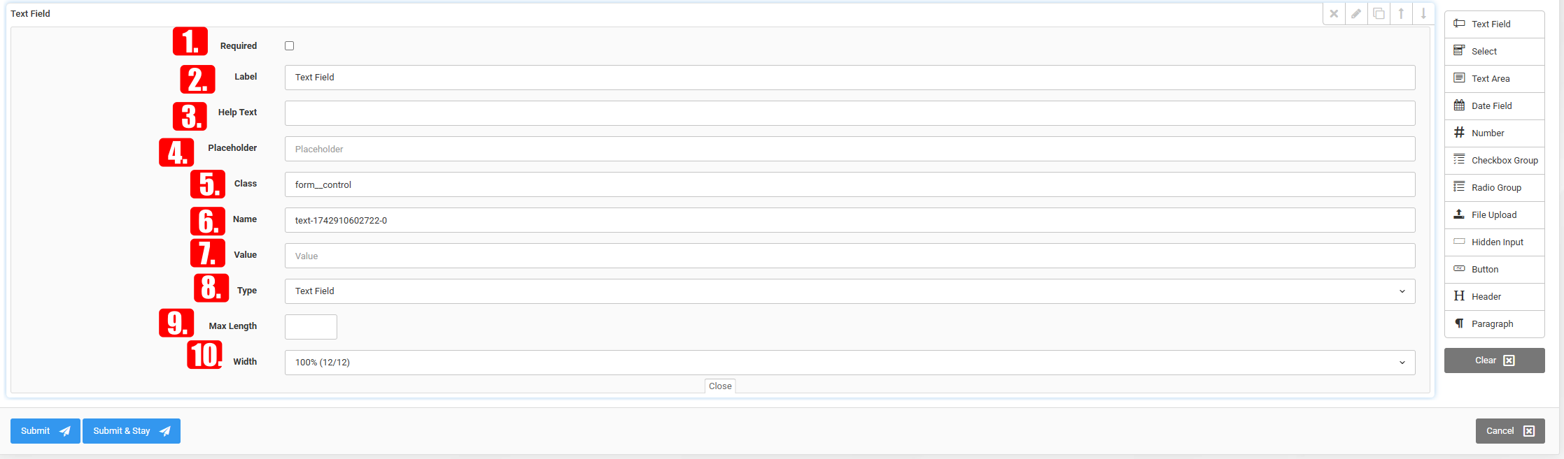
- Label - We can provide the title that appears above the text field.
- Help Text - We can explain in more detail what we mean or what we are asking for in the given field.
- Placeholder - What should appear in the text field before we click into it.
- Class - If we want to assign a style using code later, it's worth giving it a custom class.
- Name - The name of the field can be set here.

- Value - Here we can assign a value to the text field, if necessary.
- Type - We can set what type of value we expect in the text field.
- Max Length - We can specify the maximum number of characters the input text can have.
- Width - We can set the width of the input field in the form.
- How does it appear on the front end?
Select
The user can choose from multiple options when selecting.
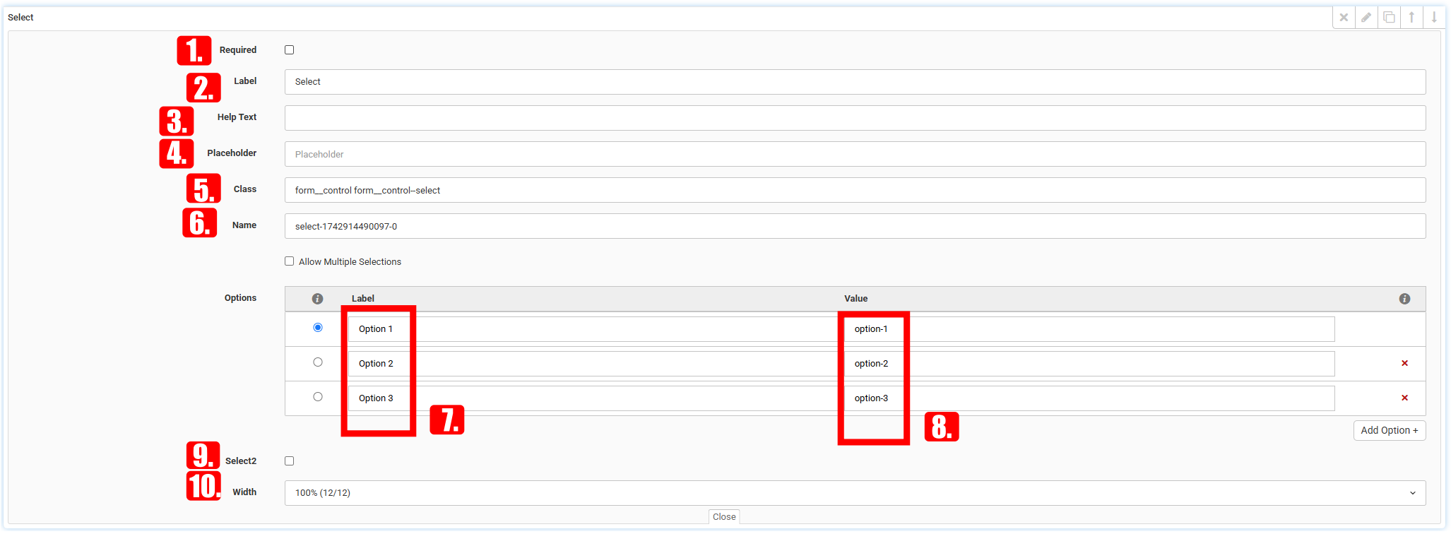
- Required – Here we can decide whether the field in the form is mandatory or optional.
- Label – We can specify the title that appears above the text field.
- Help Text – A longer explanation of what we expect from the user in that specific field.
- Placeholder – Text that appears inside the input field until the user clicks on it.
- Class – If we want to apply custom styles via code, it’s useful to assign a specific CSS class.

- Name – Here we can define the name of the input field.
- Label (for options) – For option fields, we can specify what text appears above the input options.
- Value – We can define the value of a certain metric, useful for data statistics.
- Select2 - We can enable searching among the available options.
- Width – Allows setting the width of the input field in the form.
- How does it appear on the front end?
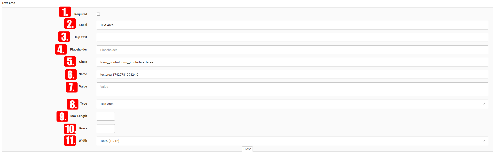
Text Area
The text box is similar to the text field, as it allows the user to input text. The difference is that the text box is suitable for entering longer pieces of text.
- Required – Here we can decide whether the field is mandatory or optional in the form.
- Label – We can specify the title displayed above the text field.
- Help Text – We can provide a longer explanation of what we mean or what we are asking for in that field.
- Placeholder – Text that appears in the input field until it is clicked.

- Class – If we want to style it later using code, it’s useful to assign a custom CSS class.
- Name – This is where we define the name of the field.
- Value – We can assign a value to a metric; this is important for data statistics.
- Type – We can define what type of value is expected in the input field.
- Max Length – We can specify the maximum number of characters allowed in the text field.
- Rows – Here we can set how many rows the text box should have.
- Width – We can set the width of the input field in the form.
- How does it appear on the front end?
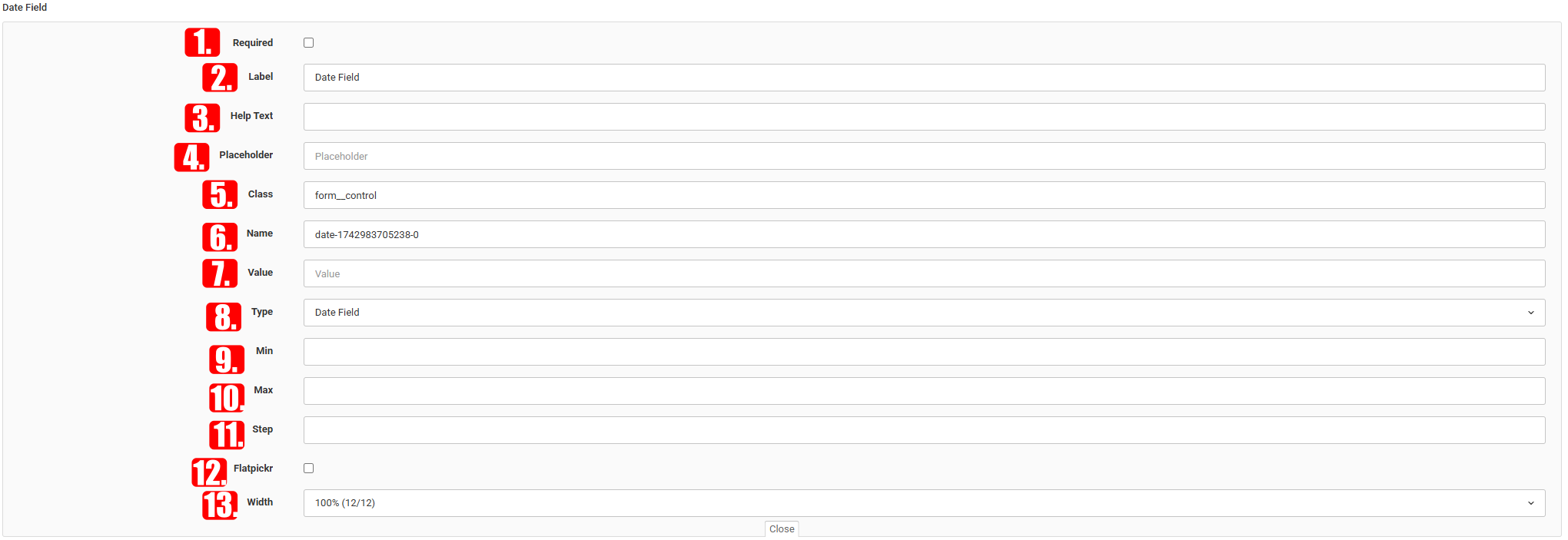
Date Field
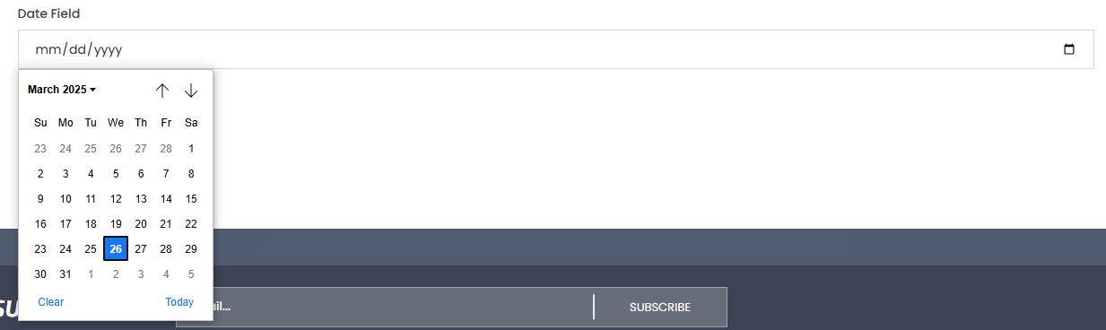
The date field allows users to easily select the desired date.
- Required – Here we can decide whether the field is mandatory or optional in the form.
- Label – We can specify the title displayed above the text field.
- Help Text – We can explain in more detail what we mean or what we are asking for in that field.
- Placeholder – Text that appears in the input field until the user clicks on it.
- Class – If we want to style it later using code, it’s recommended to assign a custom CSS class.
- Name – This is where we define the name of the field.
- Value – We can define the value of a field. This is important for data statistics.
- Type – We can define what type of value is expected in the text field.
- Min – We can specify the earliest date that can be set.
- Max – We can specify the latest date that can be set.
- Step – If we enter a number x, every x-th date will be selectable.
- Flatpickr – This allows us to change the appearance of the date input format.
- Width – We can set the width of the form field.
- How does it appear on the front end?
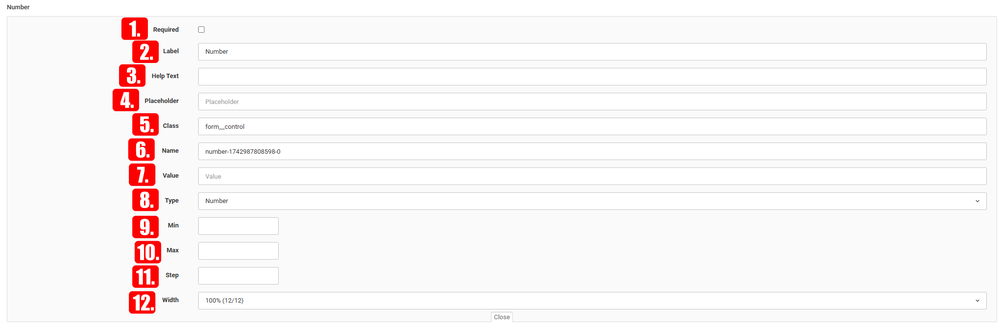
Number
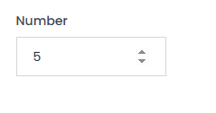
The number field allows the user to enter a numeric value.
- Required – Here we can decide whether the field is mandatory or optional in the form.
- Label – We can specify the title displayed above the text field.
- Help Text – We can explain in more detail what we mean or what we are asking for in that field.
- Placeholder – Text that appears in the input field until the user clicks on it.
- Class – If we want to style it later using code, it’s recommended to assign a custom CSS class.
- Name – This is where we define the name of the field.
- Value – We can define the value of a field. This is important for data statistics.
- Type – We can define what type of value is expected in the text field.
- Min – We can specify the earliest date that can be set.
- Max – We can specify the latest date that can be set.
- Step – If we enter a number x, every x-th number will be selectable.
- Width – We can set the width of the form field.
- How does it appear on the front end?
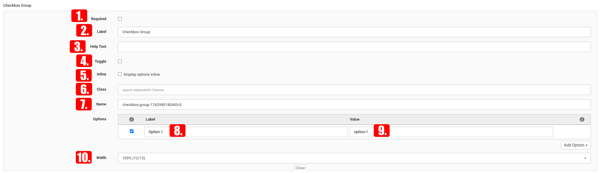
Checkbox Group
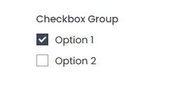
The checkbox group allows users to select more than one option from a list of choices.
- Required – Here we can decide whether the field in the form is required or optional.
- Label – We can set the title that appears above the text field.
- Help Text – We can explain in more detail what we mean or what we are asking for in the given field.
- Toggle – If enabled, a toggle switch will appear instead of a checkbox.
- Inline – By default, options appear one below the other, but if this is enabled, they will appear side by side.
- Class – If we want to apply custom styles later via code, it’s useful to assign a custom CSS class.
- Name – This is where we can define the name of the field.
- Label (for options) – Allows setting the text displayed above input options.
- Value – We can define how much value a metric has. This is important for data statistics.
- Width – We can set the width of the form field.
- How does it appear on the front end?
Radio Group
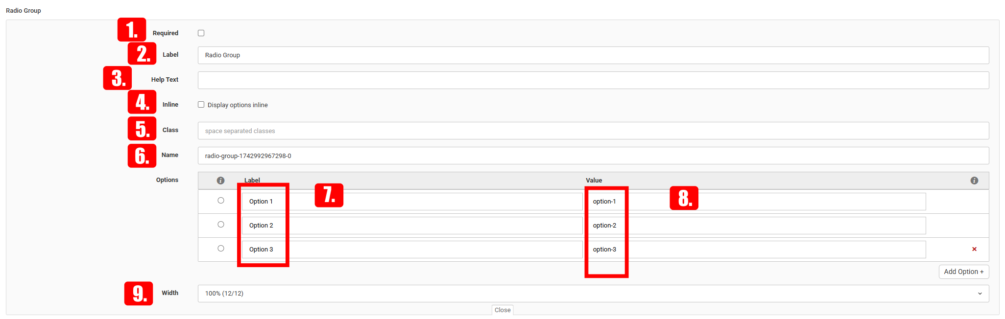
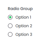
The radio button group allows the user to select one option from multiple choices.
- Required – Here we can decide whether the field in the form is mandatory or optional.
- Label – We can set the title that appears above the text field.
- Help Text – We can explain in more detail what we mean or what we are asking for in the field.
- Inline – By default, options appear below each other, but if enabled, they will be displayed side by side.

- Class – If we want to apply styles later via code, it’s useful to assign a custom CSS class.
- Name – This is where we set the name of the field.
- Label (for options) – Allows setting the text displayed above the input options.
- Value – We can specify the value of a metric. This is important for statistical data.
- Width – We can set the width of the form field

- How does it appear on the front end?
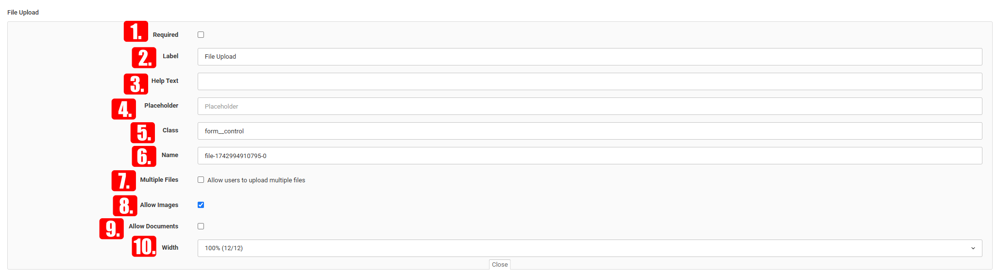
File Upload
File upload allows users to easily attach and submit the desired documents or images.
- Required – Here you can decide whether the field in the form is mandatory or optional.
- Label – You can specify the title that appears above the text field.
- Help Text – You can explain in more detail what you mean or what you are asking for in the given field.
- Placeholder – What should appear in the text field until it is clicked.
- Class – If you want to apply a style later with code, it's worth assigning a custom class.
- Name – You can specify the name of the field here.
- Multiple Files – Here you can allow multiple files to be uploaded at once.
- Allow Images – You can set whether image uploads are allowed or not.
- Allow Documents – You can set whether document uploads are allowed or not.
- Width – You can set the width of the form field.
- How does it appear on the front end?
Hidden input
The hidden field allows data to be submitted with the form without being entered by the user.
- Name — we can specify the name of the hidden field
- Value — we can assign a value to the hidden field, which we can use later. (this field will not appear in the form)
- Button

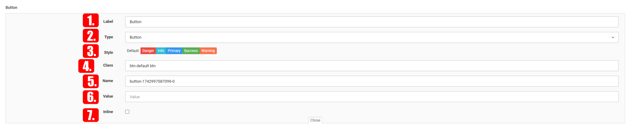
The button allows the form to be submitted or reset.
- Label – You can specify the label (text) that appears on the button.
- Type – You can define the type of the button. IMPORTANT: In order for the form to be submitted, its type must be set to "Submit".
- In order for the form to be submitted, its type must be set to "Submit".
- Style – You can select the style of the button.
- Class – If you want to apply custom styling later via code, it’s worth assigning a custom class.

- Name – You can specify the name of the field here.
- Value – You can define what value the button should have.
- Inline – If enabled, the button won’t take up a full row in the form.
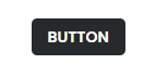
- How does it appear on the front end?
Header
The header allows you to set the title of the form.
- Label – You can specify the label text.

- Type – You can define the type of the button.
- Class – If you want to apply custom styling later via code, it’s worth assigning a custom class.
- Width – You can set the width of the label.
- How does it appear on the front end?
Paragraph
The paragraph allows you to add longer descriptions or explanations within the form.
- Tartalom — we can enter a longer text in the form.

- Type — You can define the type of the button.
- Class - want to apply custom styling later via code, it’s worth assigning a custom class.
- Width — we can set the width of the description.
- How does it appear on the front end?