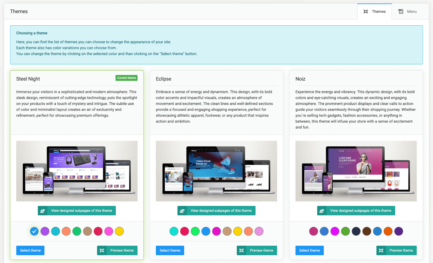
Sellvio comes with 24 stunning themes, offering users a broad range of choices. Each theme provides a unique visual identity that caters to diverse tastes and preferences. Even more impressive is that all 24 themes come with a rich palette of nine color variations. The abundance of themes and color options ensures that users can effortlessly create an online store that not only aligns with their brand’s personality but also resonates with their target audience. This results in a visually appealing and engaging online shopping experience.
To change your store’s theme, simply select one of the available themes by clicking the color wheel under the theme’s thumbnail, then click the “Select theme” button.
The webshop theme updates within seconds; to view the updated appearance, a simple page refresh in the interface is required.
Your store’s theme will update within seconds. To view the updated design, refresh the interface page.
To preview the subpages of the selected theme, click the "View designed subpages of this theme" button. This will provide you with a preview of the theme’s subpages.
After clicking the button, the webshop home page loads with the selected theme, where you can browse freely and test how the site works. The collapsible menu that appears on the right provides easy access for switching between themes and colors, making it easier to try out the different options.
To test the selected theme, click the "Preview theme" button. This allows you to test the theme live while your customers continue to see the current theme.
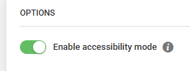
Accessibility mode
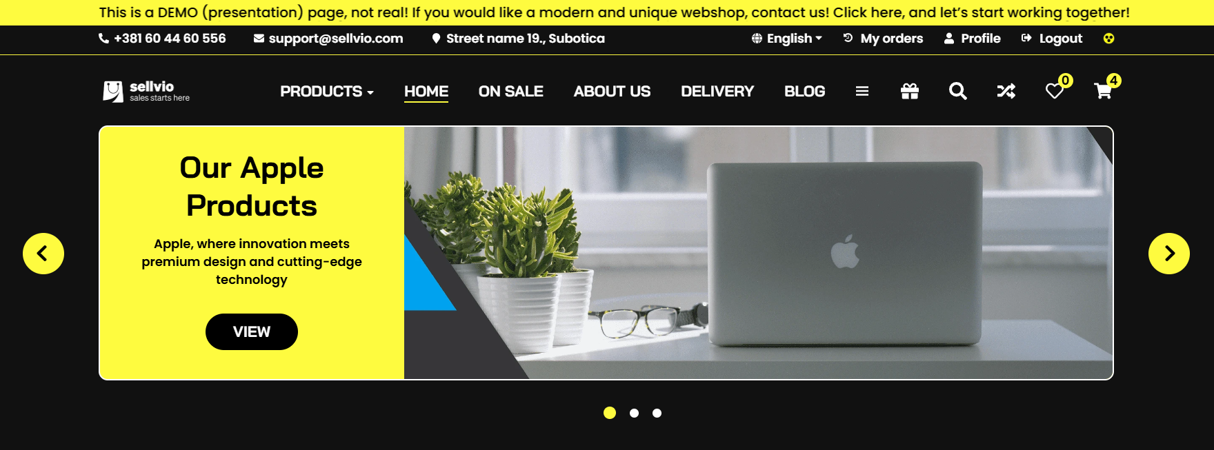
If activated, a yellow-black icon will appear in the top right corner of the screen. With it, you can switch to a view optimized for visually impaired users with a single click, which can be reverted back to the original format at any time.
Menu Selection
Sellvio offers 3 different menu structures, ensuring there’s an option for everyone. These menu structures are hierarchical systems that allow for organized and structured navigation through a website's product categories.
A well-designed menu structure helps users quickly and efficiently find the desired product or category, making it crucial that the structure is logical and reflects user habits and needs, offering the best possible user experience.
Key Elements of Menu Structures:
1. Main categories: These are the top-level categories, which usually represent the most important categories.
2. Subcategories: These are collections of more detailed categories belonging to the main categories.
3. Subcategories: If needed, they can also contain further levels that allow even more detailed filtering or navigation.
From the admin interface, you can click the "Menu" tab to choose from and customize the following structures:
Dropdown menu
Additional Customization Options:
Cursor effect - you can select which effect appears when the cursor is moved over a category
Background change
Text color change
Text underlining
Icons - Choose which category levels will display icons
Hide icons
Show icons
Show icons for main categories only
Sidebar menu
Additional Customization Options:
Icons - we can select whether icons are displayed next to main categories
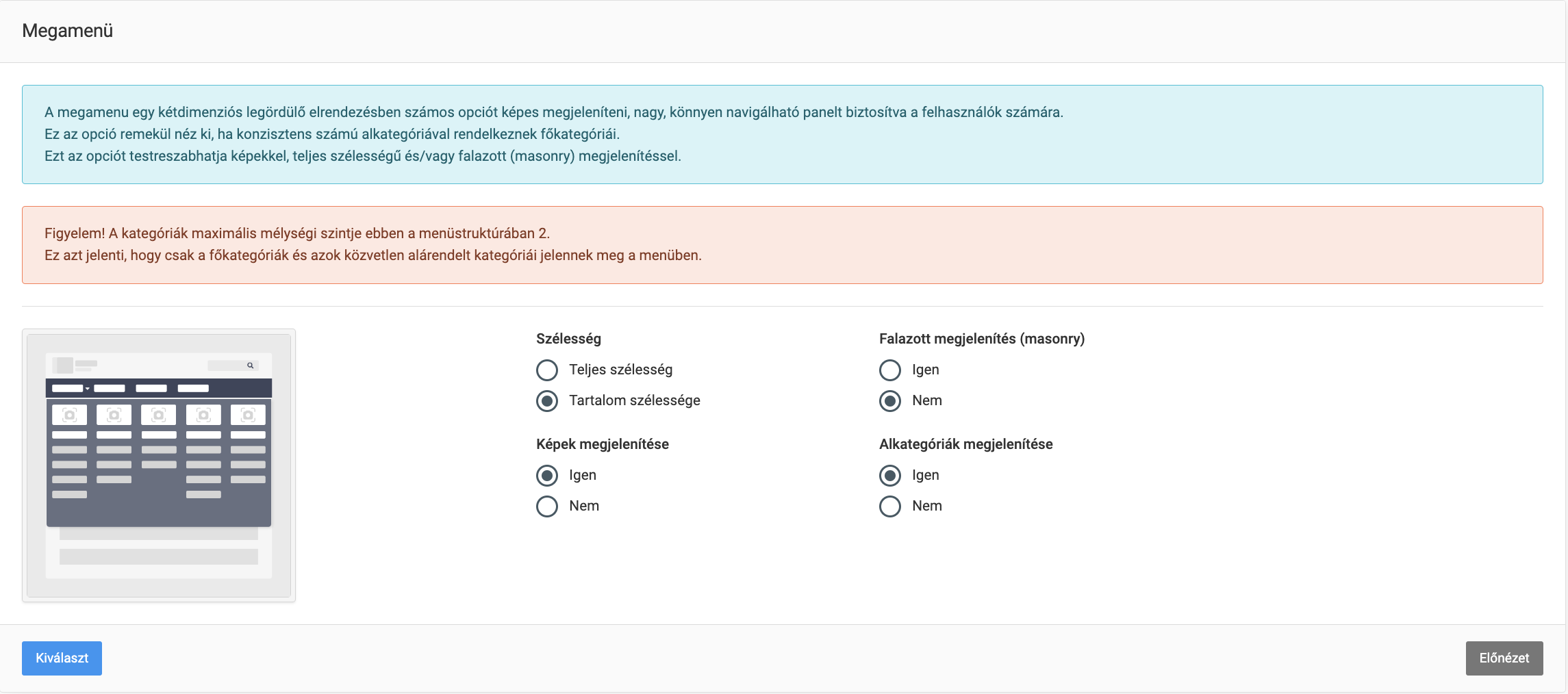
Megamenu
Additional Customization Options:
Width - you can specify whether the menu should match the content width or occupy the full screen width
Full Width
Content Width
Masonry layout - arranging elements of different sizes in a grid form with minimal spacing
Show images - display of category images
Show subcategories
Product Boxes
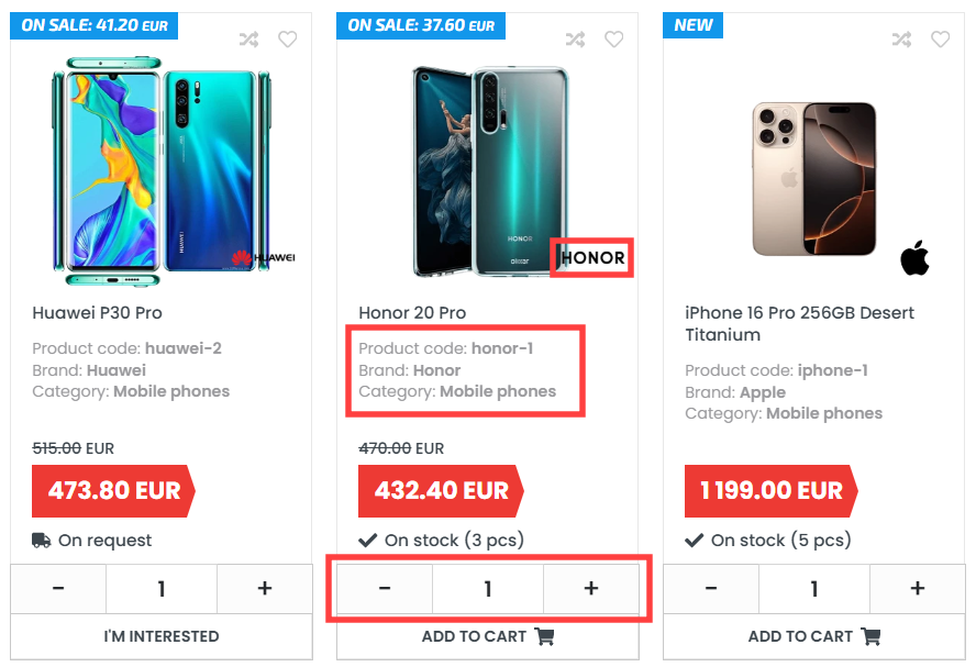
On the list pages, it is possible to display the product code, brand, and category, as well as place the brand's logo on the product image, allowing quick access to essential information.
- Product code – By enabling this option, the product codes will appear on the list page.

- Brand – By enabling this option, the product brands will appear on the list page.

- Category – By enabling this option, the product categories will appear on the list page.
- Display brand logo – By enabling this option, the brand logo will appear on the product image on the list page.


- Displaying the quantity selector – when activated, the quantity selector appears on product listing pages, wishlists, and similar product blocks.
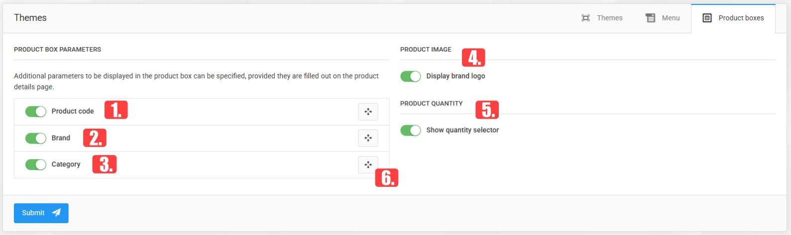
- The order can be modified using the drag handle.